Something’s Gotta Give: The REAL house!
Almost everyone interested in interior design, knows that the movie Something’s Gotta Give sparked a huge interest in set decorating. Was there anyone who didn’t love the Southampton interiors designed by Beth Rubino, Jon Hutman and Nancy Meyer’s personal designer, James Radin? Something’s Gotta Give ignited such devotion, that I suspect if a class was given on this house hoards of blog readers would sign up for it. I know I would.
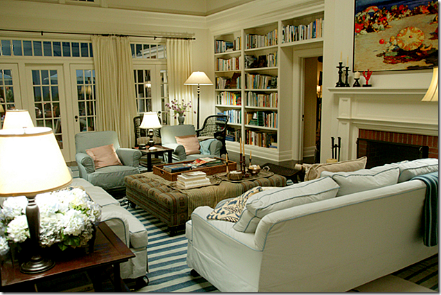
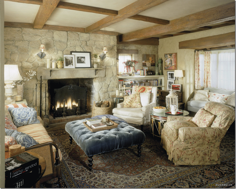
The timeless living room with its blue and white dhurri rug. The interiors still seem fresh and current despite the movie being made almost nine years old!
I know I could look at the movie and pictures of the house over and over again and still never get bored.
Of course, Something’s Gotta Give wasn’t director Nancy Meyer’s first great movie house. She has also given us Private Benjamin, Baby Boom, Father of the Bride I & II, The Parent Trap, and What Women Want – all of which featured beautiful houses. But it was her last three movies that labeled her the director of “architecture porn.” Something’s Gotta Give and The Holiday houses caused a huge expectation for her next movie - It’s Complicated. Many of us were more interested in seeing the house rather than the movie.
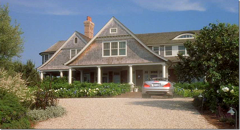
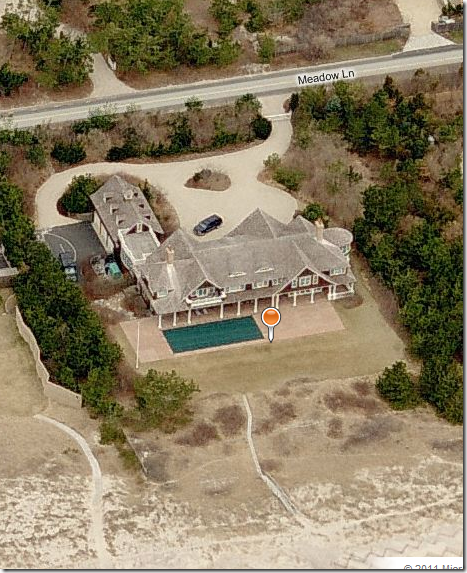
Google: The REAL Southampton house from Something’s Gotta Give.
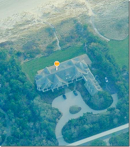
And its back view right on the beach. The house’s interior is nothing like the movie set. The movie house is U shaped with the pool located in between two wings.
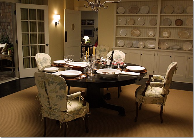
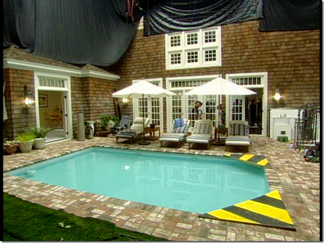
The set of Something’s Gotta Give, built on a sound stage, shows the swimming pool that sits between Jack’s bedroom and Diane’s bedroom. You can see it looks nothing like the “real” house.
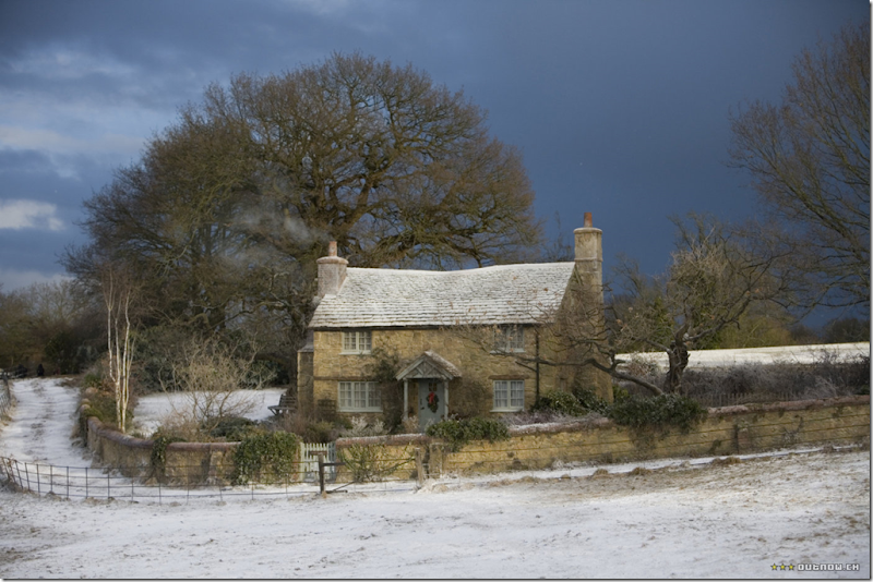
The precious cottage in The Holiday was built for the movie. Because of this, the exterior matched the interior perfectly. The interiors were, again, shot on an L.A. sound stage. The road, the wall, and the trees were all put in by the movie crew.
The inside of the cottage matched the outside. The fireplaces and windows were in the same place inside and out since the house was created expressly for the movie.
The other house in The Holiday is Wallace Neff’s own home built in 1928. Of course, only the exterior was used. The interiors were created on a sound stage.
The back of the Wallace Neff house.
The interiors of the LA. Holiday house. Just as with the Something’s Gotta Give house, the interiors do not exactly match the exteriors.
The dreamy Santa Barbara It’s Complicated house was found in Hidden Valley, California – not Santa Barbara.
The last Nancy Meyers movie, It’s Complicated, was widely anticipated for its Santa Barbara house. Of course, the house was used only for the exteriors – the interiors were shot on a NY sound stage. Stalkers tried to locate the “real” It’s Complicated house without much success. What threw people off the trail was they were looking for the house in Santa Barbara. Instead, the REAL It’s Complicated house is located in Hidden Valley – not Santa Barbara. The cute adobe ranch house is off Ventura Freeway in Thousand Oaks, 45 miles north of L.A. It was built in the 1920’s and was once the home of W.C. Fields. Meyers chose this particular house because it had an “almost identical” look to a house she had lived in for many years. “If I’d searched forever, I couldn’t have found a house that duplicated my own house more. It was definitely the environment I’d imagined Jane would live in.” Also, the house was surrounded by acres of land that allowed for the massive amount of equipment and trailers that would be needed during filming.
STALKING THE REAL IT’S COMPLICATED HOUSE:
A famous stalker of Hollywood locales “I Am Not A Stalker,” blogged about trying to find the It’s Complicated house. She was clued into its location by the presence of the white wooded fence that surrounds the property. About her hunt, she writes:
Potrero Road is an extremely long, meandering street that cuts through numerous ranch-style properties in the Thousand Oaks, Hidden Valley, and Westlake Village areas and, as you can see in the above photographs, is bordered on each side by low, white wooden fences just like Jane’s. So, I decided to begin my search there. And sure enough, about ten minutes into the hunt, I located Jane’s house! As it turns out, it is situated less than half a mile east of JMJ Ranch, which was featured in fave movie Win A Date With Tad Hamilton and the more recent Back-Up Plan with Jennifer Lopez.
Actually, though, I Am Not A Stalker could have spared herself the long search. On IMDB, under It’s Complicated filming locations, the address for the house is plainly given: 714 West Potrero Road, Hidden Valley, California. For movie devotees, the house was recently sold, and lots of delicious photos are available to study and contrast between the REAL house and the movie house!!! So enjoy!!!
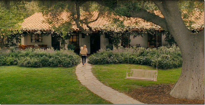
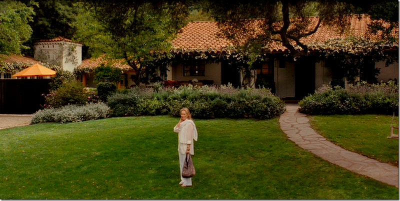
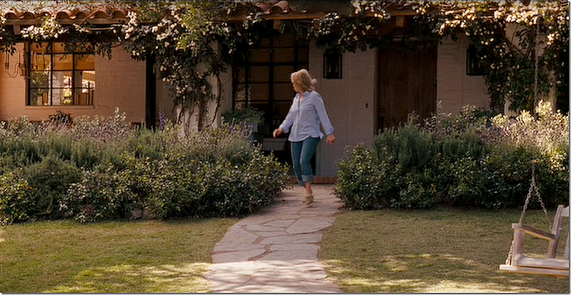
Here, in a scene from the movie, is the house with its lush landscaping and vines. To the left, behind the gates is the garage courtyard and a tower.
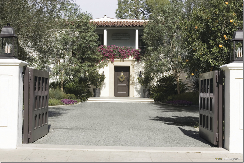
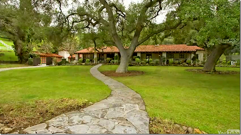
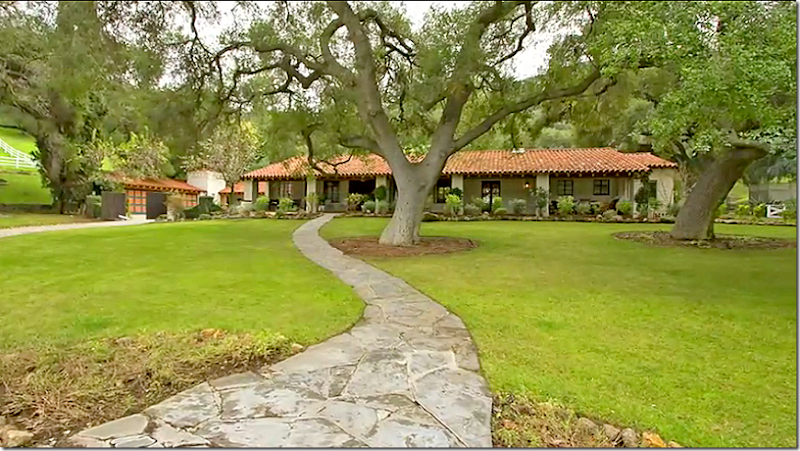
And here, is the REAL house. You can see that the landscaping and vines hanging from the movie house are absent here. The landscaping was probably not real, or was removed because the house certainly does not have that magical, lush look anymore. The gate and tower are visible here. But the famous hanging swing is missing – probably a prop from the movie.
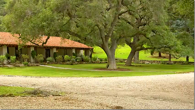
A close up of the REAL house, showing the absence of the flowering bushes and vines that made the movie house so romantic looking.
The property is located on over 100 acres that is shared by three lots. All three lots were recently packaged together for sale, but apparently, three different families bought each separate lot. Here, you can see the white fences that surround the house, just like shown in the movie.
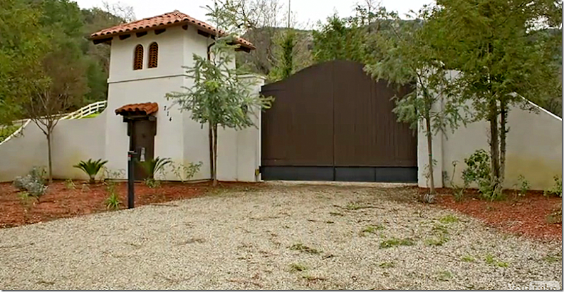
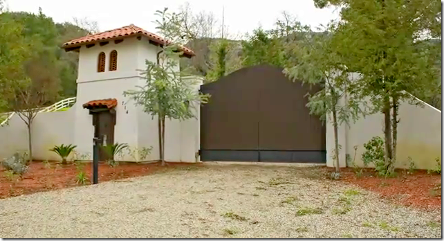
The tower and gate to the REAL property. The house is not visible from the street.
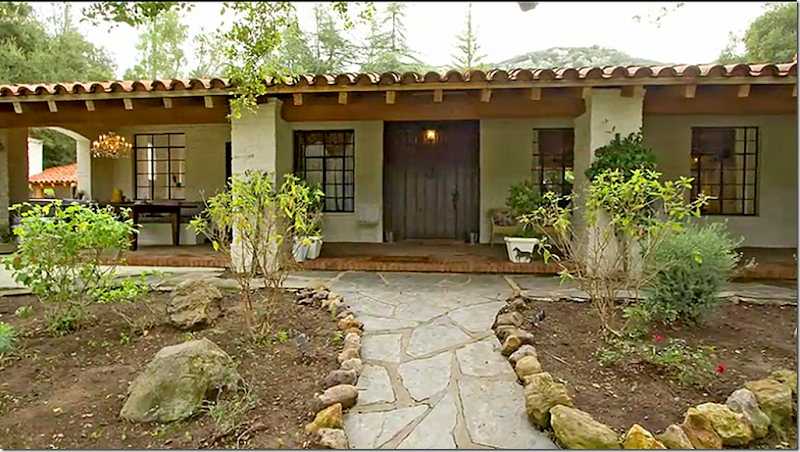
The front porch of the REAL house. Here you can really see how barren the landscaping really is. I wonder why the owners didn’t keep the bushes and vines? Notice the fancy chandelier on the left side of the porch. In the movie, that was exchanged for a more rustic one. The rocks around the beds were also removed during the filming.
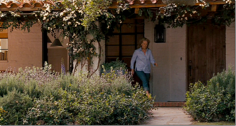
In this scene from the movie, you can see where woven window shades were added along with a lantern. Inside the door is the kitchen where the pendant lights were added to the REAL house. Remember though, the interiors were actually shot in on a NY soundstage. But when Meryl walks out the house, it needs to look the same as the interior sound stage. Thinking about it, that must be hard to film. You do the scene inside the kitchen in the NYC sound stage. Then a month later, you continue the same scene – walking outside – in California!! Must be so strange!!!
In this shot, you can see how the landscaping beds with the large rocks were removed for the movie. Also, notice how they changed the front door. It looks like they added fake white brick to make the door smaller and then they added the two lanterns to make it prettier. And notice the hanging iron chandelier instead of the owners’ more dressy one.
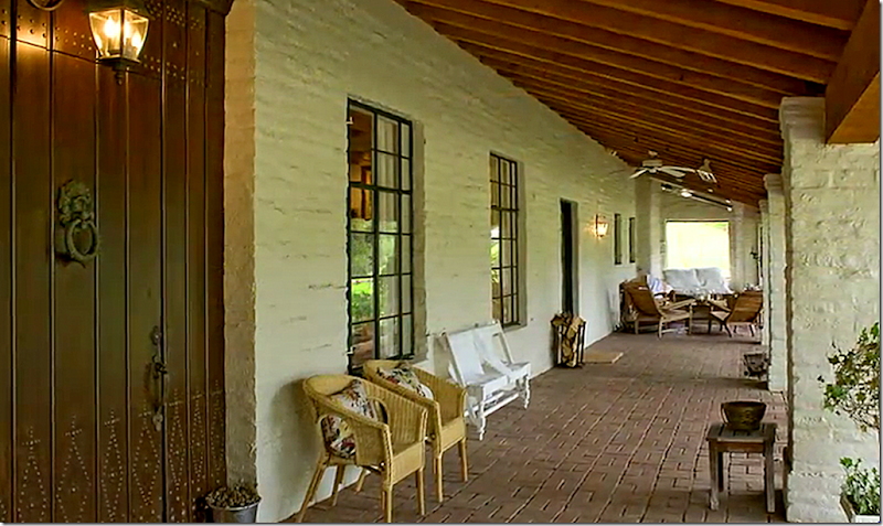
The REAL house – here you can see the wide front door that wasn’t used in the movie. In the picture below, you can see how they dressed up this front porch for the movie.
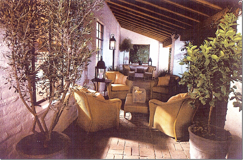
From the movie: In a night time shot, here is the front porch dressed up with great furniture, lanterns, and fruit trees. The ceiling fan is gone too. I wonder why the owners didn’t keep this furniture? It looks so pretty here – I love this! Do you think the movie offered to sell it back to them at a discounted price?
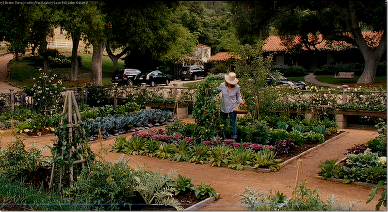
The gorgeous vegetable garden was built in the grassy area across from the house. After shooting, the garden was donated. In real life, vegetable gardens are not usually this beautiful and manicured! Nature is not quite as cooperative.
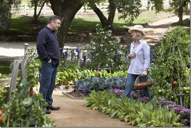
A close up shot of the beautiful garden. I love the fence with the vines and flowers covering it.
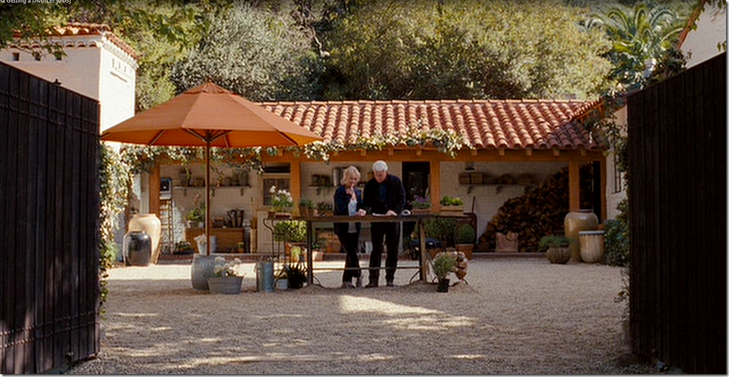
In this shot from the movie, you can see where the tower and the garage and the wing off the house meet to form a courtyard behind the gate.
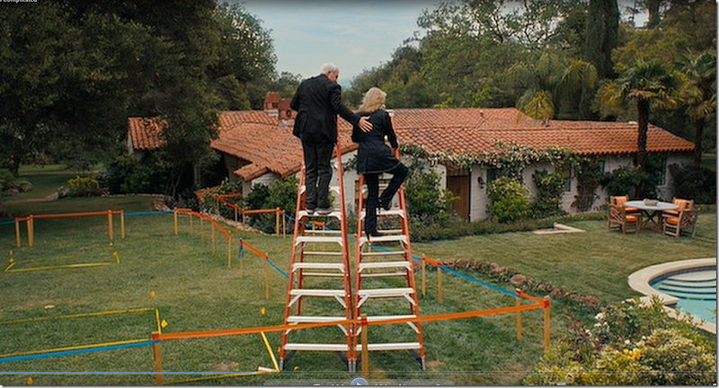
In this important scene, the area is set up to review the floor plans. There are no pictures of this area in the REAL house, but I’ll wager it doesn’t look anything like this! I would guess they added all the gravel and maybe even added the white brick against the back wing.
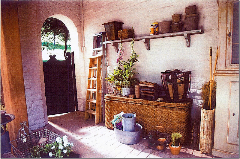
A close up of the back building in the garage courtyard. I wonder if the arch is real and if the gate came with the house or the movie?
In this picture of the REAL house, you can see the garage is not quite that charming! It’s amazing what a little gravel and paint can do.
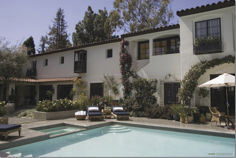
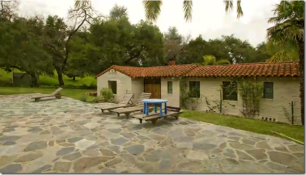
The back of the REAL house with the swimming pool. The house is a square, built around a central courtyard that you can’t see in this picture.
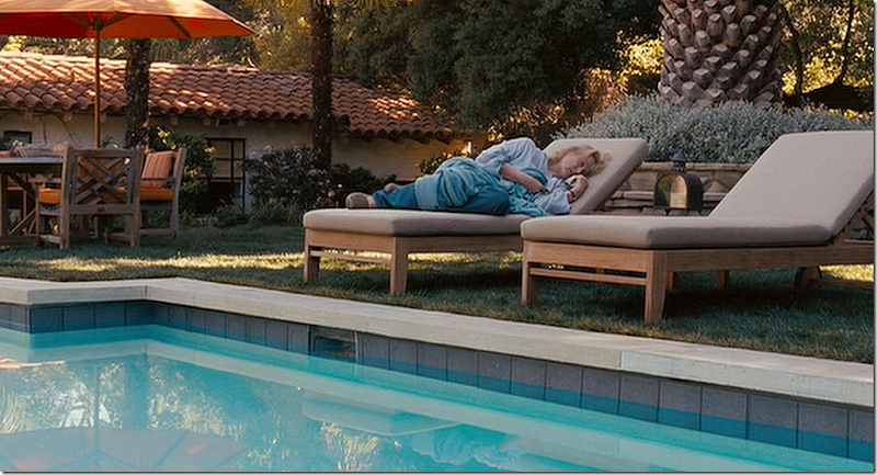
Close up of the REAL house shows the pool area with the stone terrace around it. In the photo below, you can clearly see where the film crew covered up all the stone with grass.
This was taken in the back yard. You can see the large tree behind Meryl that is in the REAL backyard. The movie crew added all the lush plants around the tree. And of course they added lots of furniture to make it much prettier than it really is.
Here you can see where they added all the hanging vines and landscaping to the back of the house. It’s amazing how much more romantic the house looks like with those hanging vines. I hope the new owners plant some – they look so pretty!!! This scene is where the architect takes Meryl “upstairs” to see the view from her new bedroom. The view is of the ocean, but you can see that you can’t really see the ocean from here – it’s all Hollywood magic. To the left is her new kitchen. Since her old “kitchen” is at the front of the house by the garage, it makes no sense why the new kitchen would be added all the way to the back of the house! A plot flaw of the movie that critics mentioned in reviews is why she would be adding a new kitchen any way. Her kitchen as it is now, is considered the focal point of the house and seems more than adequate.
All the extra landscaping and vines created a very lush and soft appearance to the house. Production designer Jon Hutman recalled that during the editing process of the backyard “a water view was created where none existed. Nancy wanted all the dead trees edited out. Then it was on to the spiky plants. ‘Every plant that is spiky is removed from this movie,’ she announced, a note of hard-won triumph in her voice. ‘You have no idea. Keep it all soft.’”
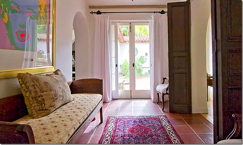
In the REAL house, the entrance leads to the courtyard that is surrounded by the house on all four sides. Pretty doors lead into the living area.
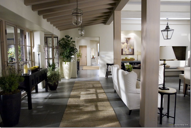
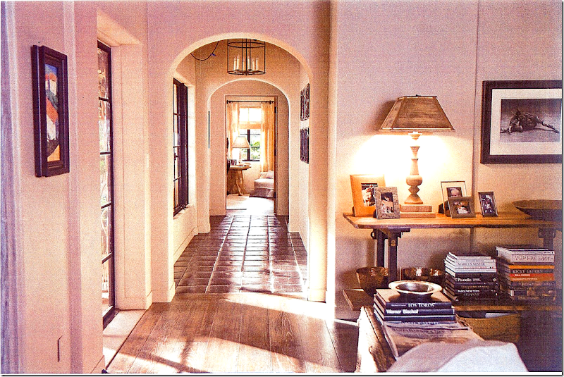
The movie house: the main hall leading from the front door into the living area. Since the interiors were done on a sound stage, they don’t have to match the REAL house’s interiors at all. Interestingly, they used wood and similar terra cotta tiled floors as found in the REAL house . And note that the arches found in the REAL house are repeated in the movie house.
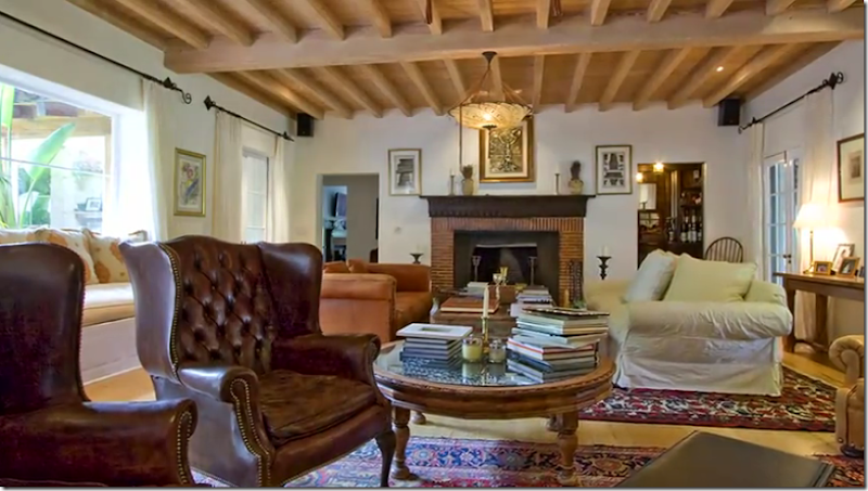
The REAL house’s living room has a beautiful beamed ceiling and overlooks the central courtyard.
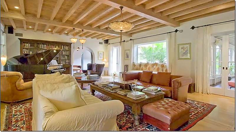
Looking the other way, the room is large enough for a piano and different seating arrangements. Several different Fortuny light fixtures illuminate the space.
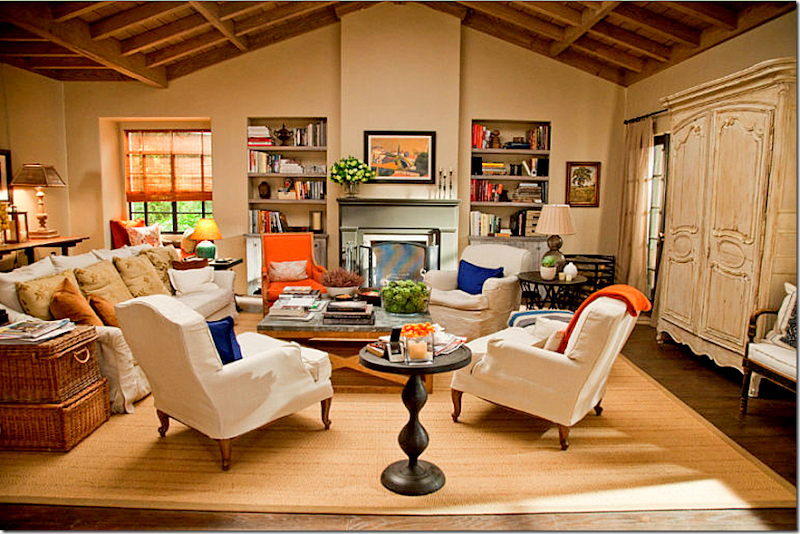
In the movie house – the living room has a similar beamed ceiling, but it is arched here while it is flat in the REAL house.
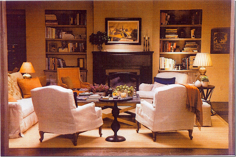
The movie set living room: Nancy explained that she wanted the design to relate to the warmth and sunshine of Santa Barbara. She chose the color orange as an accent because it reminded her of all the terra cotta in that region. I love the décor – the slipcovered furniture, the seagrass rug and all the Belgian touches – the coffee table, and the painted armoire. I just noticed something I never saw before – the stacked baskets by the side of the sofa. Cute!
`
I personally never really cared for the orange and the blue touches though. I think the accents were too jarring. Beth Rubino the set decorator listed her sources for this room. The two arm chairs in front are from 1st dibs and wear Calvin fabric. The coffee table came from Lucca Antiques. The back chair and ottoman are George Smith (only the finest for Nancy Meyers.) The various antique accessories came from such well known shops as Joseph Stannard Antiques, Berkshire Home & Antiques, Treillage, Dessin Fournir, and Cupboards and Roses Antiques. The blinds came from American Screen & Window Coverings.
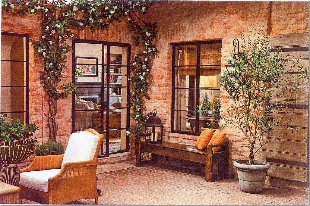
Off the living room and dining room is this patio. This is actually a set created on the NY soundstage. In the REAL house, there is a courtyard off all the rooms in the house.
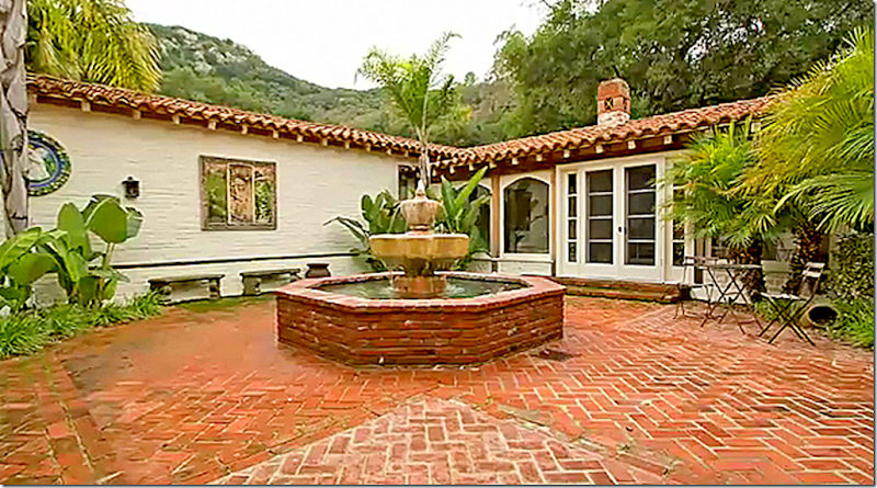
The REAL house: here is the four sided courtyard in the middle of the house. You can see the one wing on the right that was enclosed at one point. You can imagine if the movie had used this courtyard as part of the set – how beautiful they would have made it! I wonder if they would have put down gravel or left the mismatched brick exposed. I’m sure they would have put up all the hanging vines and plants and pots full of flowers. There would be fabulous new furniture, like on the front porch. And lanterns would have been added on the brick walls.
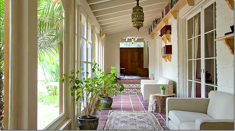
The porch that was enclosed in the picture above. Again, I would love to see see what Beth Rubino would do to this space if the movie had used the REAL house for its interiors!!! I love those high, beamed ceilings – and that lantern is so exotic.
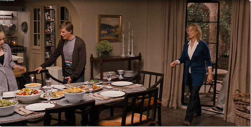
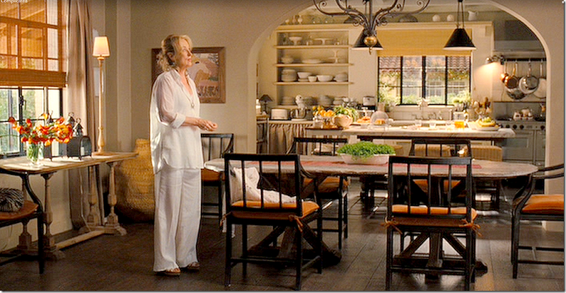
There is no dining room shown for the REAL house – so let’s look at the movie house dining room. The dining room lies between the living room and the kitchen. These three rooms all face the front porch and this setup coordinates with the REAL house. It’s apparent that the person who designed the set house used the REAL house layout as inspiration so that the exterior shots would line up. Here you can see the son in the kitchen looking into the dining room. I always loved the French windows that separate these spaces.
Facing the other direction, you can see the back porch on the right. Notice the antique shelf on the right. I love those so much and wish I had the space for one in my dining room. It’s great to use when you are out of cabinet space. Notice the attention to detail the Beth gave the room – the shelves are filed with extra plates instead of left bare.
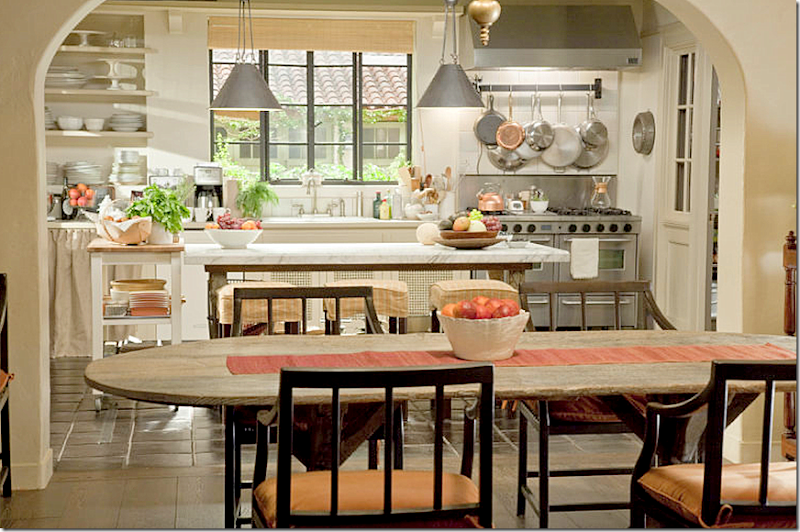
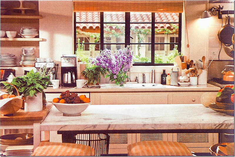
In this view, you can see the beautiful kitchen, although this is the room Meryl wants to demolish and rebuild on the other side of the house!!! Notice the darling vignette on the left side with the limed table and lanterns and tall lamp. So cute! Rubino designed the dining room chairs herself and had Berkshire Home and Antiques make them. The oval table is from Lucca Antiques. In the kitchen the island’s iron table is by Robert Ogden. The marble top was custom made. Plates are the very beautiful Astier de Villate. The light fixture over the table is by Paul Ferrante.
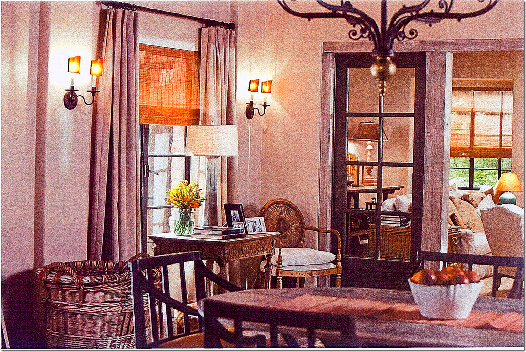
I love this side of the dining room which overlooks the back patio. The large stacked baskets, the unstained table and chair, the lamp, the sconces, and the unlined sheer linen curtains.
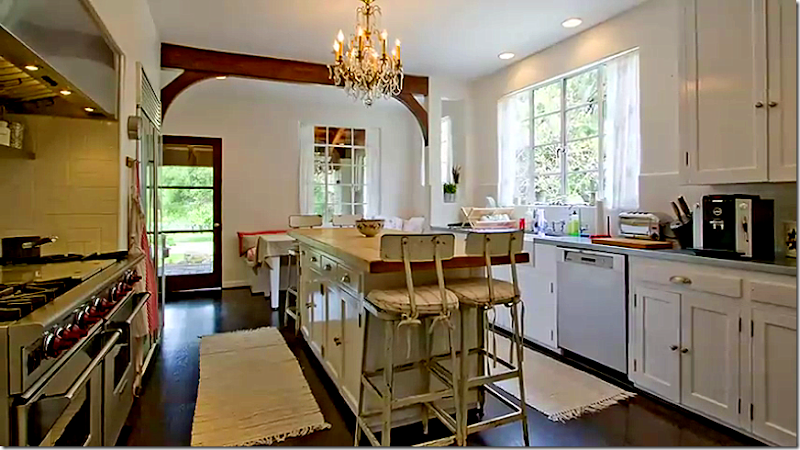
The REAL House: the kitchen in the REAL house is so pretty! I think it’s my favorite room. What’s interesting is it is in the same exact spot as the kitchen in the movie house. The window and door to the left lead out to the front porch and the side window over looks the garage courtyard. In the scene mentioned previously, Meryl walks out of the kitchen on the soundstage through this door onto the front porch. Because the door is opened and the movie goer gets a glimpse inside, the homeowner’s chandelier was removed and the same pendant lamps in the movie house were placed in this kitchen. Also, they added the same textured shades to the REAL house to match the movie house. The attention to detail is amazing and so intricate.
Looking from the dining room into the kitchen. Another difference in the two houses is the windows. In the movie house, the windows are black steel. In the REAL house, they are mostly white. I assume they painted them, then repainted them when the movie was over. What a mess. Why would anyone want a movie filmed at their house? I wonder if they pay a lot? That must be the only reason you would put up with all that destruction to your house. I wonder how much they do pay?? hehe.
The garage doors that are seen through the kitchen window are so cute. They look like carriage doors. Everything about this house is so cute!!! Do you think her kitchen is too small for a professional cook that it would need to be totally replaced?
The marble top was custom made for the iron base. Beyond the French doors is the laundry room.
This side of the kitchen is so cute with the linen curtain instead of cabinets.
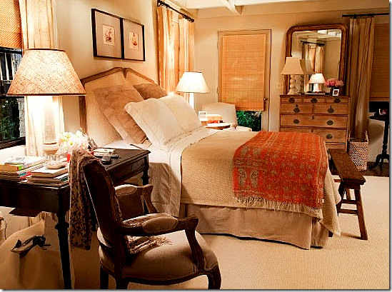
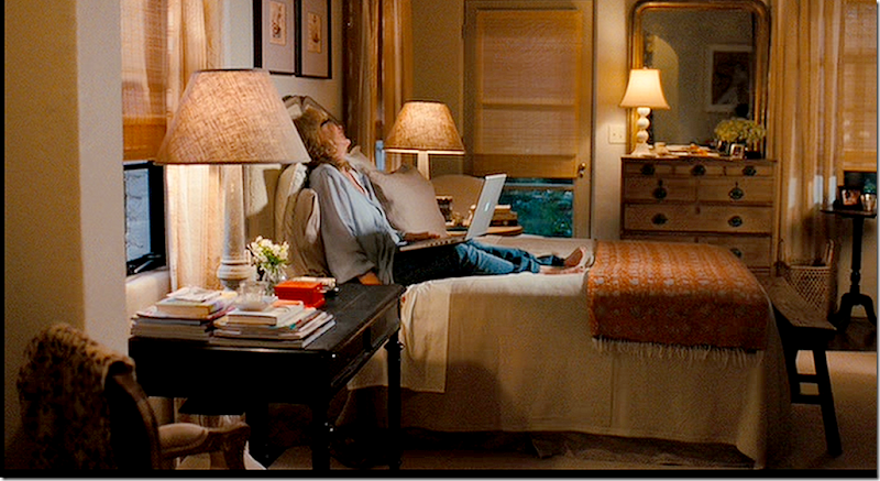
Meryl’s bedroom is small, so I can understand why she might want a new one, especially one that would be on the second floor with a view of the Pacific ocean. Again, the colors are taupe and sand and orange – influenced by Santa Barbara. I love the way Rubino added the antiques – such as the chest and the Louis Philippe mirror.
A larger view from movie of the bedroom – right before the funniest scene. When the movie came out last Christmas, I was disappointed in it and didn’t like it all that much. Certainly not anywhere near as much as I liked The Holiday or Something’s Gotta Give. But, since then, after watching it a few more times on cable TV, I actually truly like it a lot more! I think I was just so excited about the moving coming out and probably expected too much from it to be objective about it. I would definitely recommend seeing it if you haven’t yet.
Her bathroom is so pretty – with the claw foot tub, antique mirror and marble countertops. According to Hooked on Houses, Meryl is actually not sitting in water. They built a wood shelf for her to sit under. On top of the shelf was a pan of water where she kept the wet washbloths. This allowed her to sit in the tub for the many days it took to film this scene without turning into a prune. Notice how the floor is subtly checkerboard by using a lighter and darker marble.
A larger view of of the bathroom. Here, it looks like the floor is actually painted wood, not marble. Remember in Something’s Gotta Give how the kitchen soapstone countertops were actually painted plywood? I love the linen shower curtain too!
The REAL House: The master bedroom is pretty with its fireplace and arched doorways. Again, I would love to see what this room would look like under Beth Rubino’s touch.
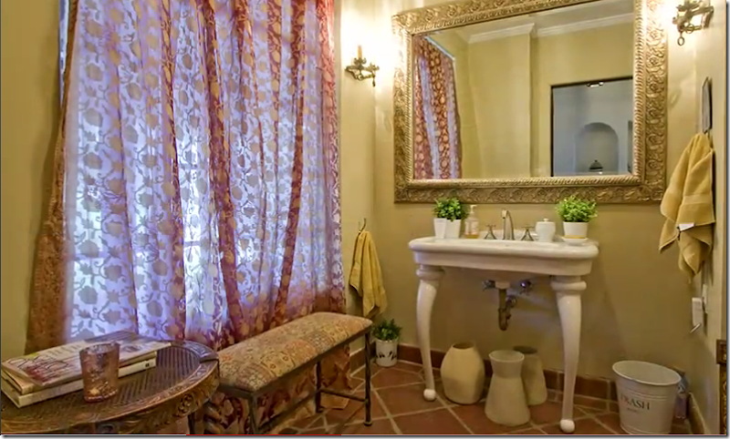
The REAL House: I like the sink and the floor. I love terra cotta floors with wide, white grout. The wider, the better! Ben and I built in a house in Ft. Worth and we had terra cotta floors. The builder made the grout extra wide for me. To me, it makes it look older – but some people prefer tiny grout. It’s a personal preference.
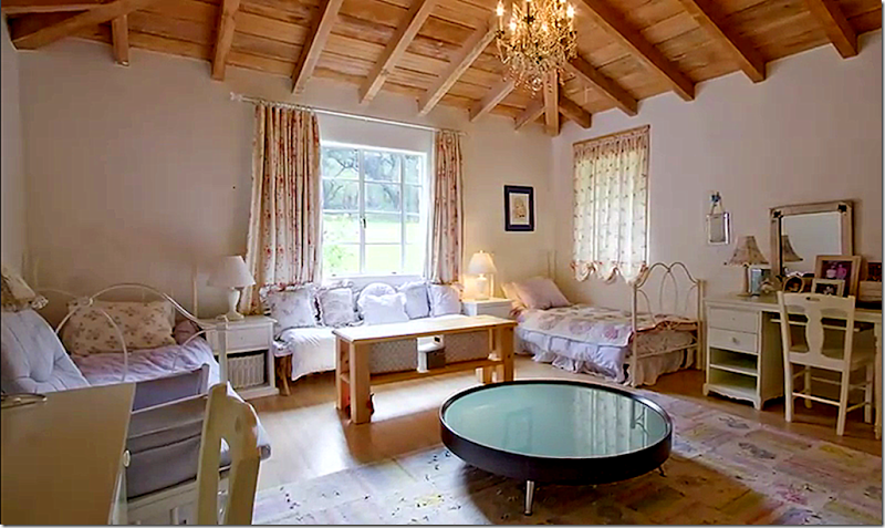
The REAL House. The daughters bedroom actually has more charm than the master bedroom because of the vaulted beamed ceiling! I think this room is so architecturally pretty. I would love to decorate it! How would you decorate it?
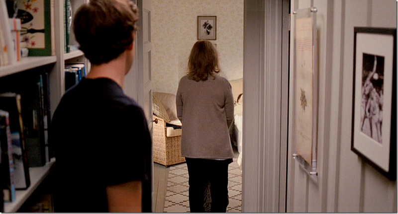
The daughter’s bedroom in the movie. Meryl’s oldest daughter is living in a darling cottage where they have a garden party for her brother. But it is bedroom that really caught my eye. I love the carpet – which you get a quick glimpse of when Meryl enters the room.
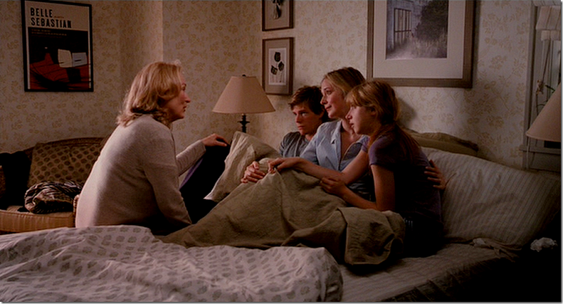
The room is so cute because of the wallpaper – a taupe Farrow and Ball paper called Melrose. The paper goes so well with the Indienne bedspread.
Melrose by Farrow and Ball comes in many colorways. It is a charming paper – I wish it also came in a fabric!
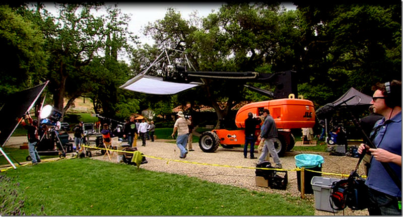
What it looked like filming outside the REAL house in California.
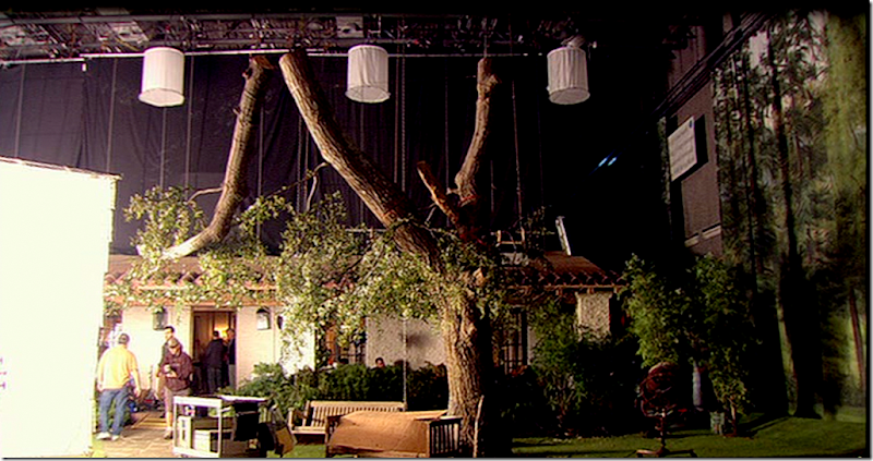
And this amazing picture is of the house built on the NY soundstage. It looks exactly like the REAL house. Notice the fake trees in front. And notice the hanging mural of trees to the very right of this picture. Hard to believe they built the entire house on a soundstage.
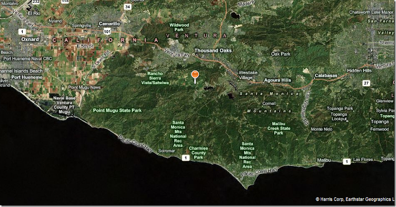
So, where exactly IS the REAL movie house? Located in Thousand Oaks off the famous Ventura Freeway, the hotse is north of Malibu and south of Santa Barbara. The actual house is where the orange lollypop is.
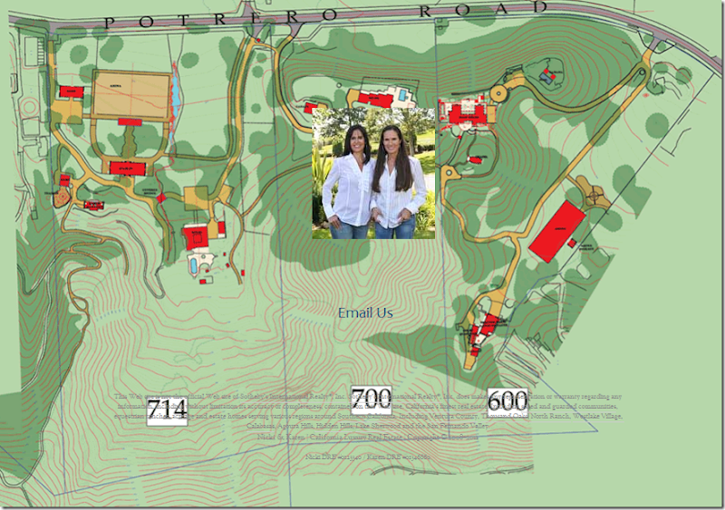
The original property is over 100 acres divided into three estates. The REAL house is at 714. Recently, all three properties were available for sale. Each was sold to three different owners. You can see the house on the map where the red square is, right above the blue swimming pool.
Here is a Bing picture of the REAL house – here you can see how it is a square surrounding a center courtyard. The swimming pool is behind the house. Extending off to the left of the house is the garage courtyard where Meryl and Steve Martin looked over the floor plans. In front of the house, past the trees and the street is a patch of grass. This is where the vegetable garden was. Horse pastures are to the left of the house.
Here is where you turn onto the property off Potrero.
The gate house at Potrero where you gain entrance into the estate.
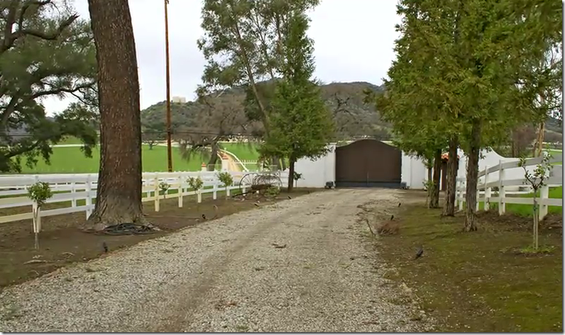
The long drive up to the house.
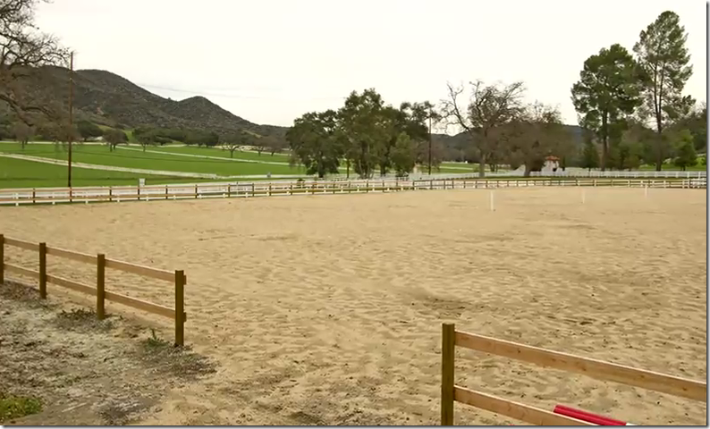
The riding arena. You can see the gate house in the back, right.
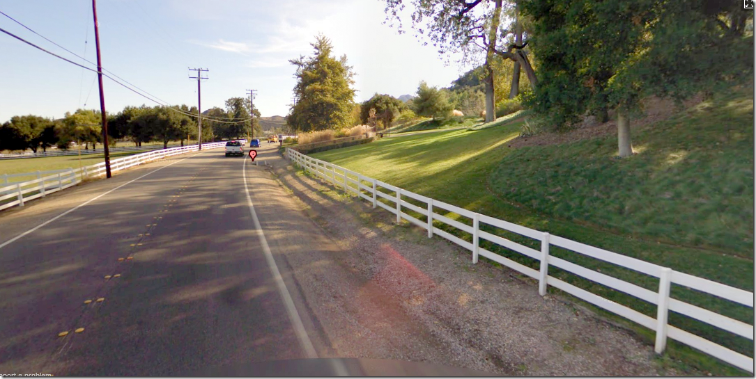
The area is known for its white fences which keep the horses corralled.
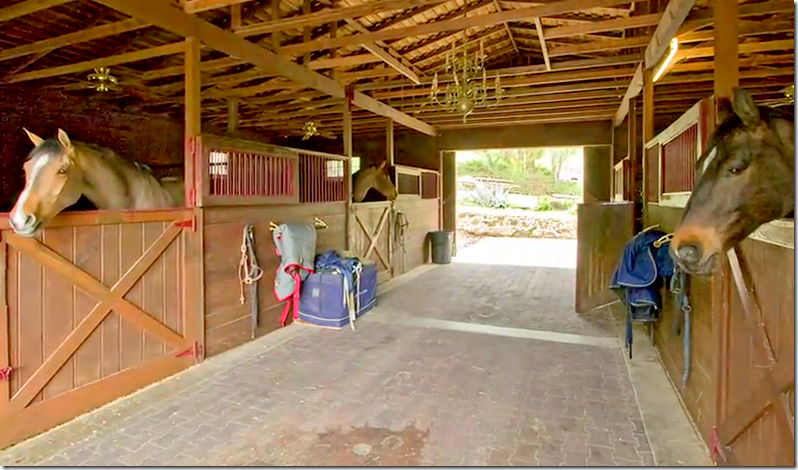
On the property is a large stable. Too bad Meryl didn’t ride horses in the movie! The three properties are filled with miles of trails to ride on.
So, what is Nancy Meyers working on now? There has been no notice of what her next movie is going to be. Last November there was a press release that she had left her long time agent ICM and a few days later it was announced she was now at WME. (Whatever THAT all means!!!??) It’s been over a year since It’s Complicated was released and usually by this time, we would know what new script she is working on. Perhaps with the change of agents, she isn’t writing one now. It was reported that she was building her dream house, though her present house is pretty dreamy itself. I wrote a story about her house HERE. To read I Am Not A Stalker’s account of her stalking of the REAL house, go HERE. Read Hooked on Houses account of It’s Complicated HERE. To read Cinema Style’s story on It’s Complicated, go HERE. AND, to listen to Beth Rubino on the Skirted Roundtable (it’s a good one!) go HERE. Interesting too is that It’s Complicated is the last movie that Beth Rubino worked on. Jon Hutman worked on The Tourist and another movie that hasn’t been released yet. I can’t wait to hear about Nancy’s next movie!!!!! Something tells me that soon she will be writing a movie about grandparents. Finally, to see all the real estate pictures of the REAL house, go HERE.
Notice for Houstonians:
CdT Sponsor Antiques and Linen and Janet Wiebe are having a French Container Unloading.
It started this week and continues through Saturday, Feb. 26.
1003 West 34th Street, Suites A & D
call 713-880-9449 or 512-7734499
www.AntiquesAndLinens.com
www.JanetWiebeAntiques.com











.jpg)
0 comments:
Post a Comment